
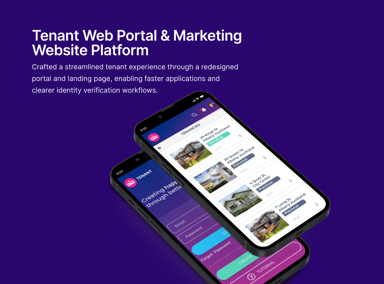
Tenant Marketing Website Platform & Web Portal
Project information
- Category: Web application (Software as a Service)
- Client: The Tenancy Practice Service
- Project date: June 2020 - June 2021
- Project URL: tenant.co.nz
Note: The company updated its branding in 2025, which included a change in background color. The original logo was intentionally aligned with the previous background used across the web portal and marketing website platform. This update reflects the new brand palette and visual identity.
Role & Responsibilities
- Role: UI Designer & Front End Developer
- Key contribution: UX/UI Design, UX Evaluation & Accessibility Audits, Ideation & Concept Development, Drawing and illustrations, Prototyping & User Testing, Prototyping & Usability Testing, Stakeholder Communication & Design Advocacy
Overview
I led the complete redesign of a property management SaaS platform and its marketing website, used by property managers and tenants across New Zealand. The existing experience was outdated, visually inconsistent, and challenging for users with varying levels of digital literacy. The goal was to create a modern, accessible, and intuitive platform focused on clarity, simplicity, and inclusive design principles. This initiative aimed to reduce friction, improve task success rates, and better communicate the product's value.
Problem Statement
How might we redesign the platform to support users with limited digital literacy — without sacrificing clarity, accessibility, or emotional engagement?
Empathise
Initial research revealed significant friction and frustration for users navigating the outdated platform. Feedback from stakeholders and users highlighted that the platform felt dated and difficult to navigate, particularly for those less comfortable with technology. The website also failed to clearly communicate the product's core value.
Key pain points identified during discovery included:
- Poor Readability: Hard-to-read text due to poor contrast
- Confusing Navigation: Unclear navigation and form flows caused user difficulty
- Irrelevant Visuals: Visual elements distracted from core tasks
- Lack of Guidance: Limited guidance for users unfamiliar with digital platforms
To validate these findings, I conducted a heuristic evaluation and an accessibility audit using WebAIM standards, focusing on contrast ratios, font sizes, and keyboard navigation. The results were prioritized using a severity-impact matrix to inform our redesign efforts.
Define
Problem Definition
The platform’s outdated interface and inconsistent visuals created friction for users—especially those with limited digital literacy—making essential tasks unnecessarily difficult and obscuring the product's value. The website failed to communicate the product’s value, while the web portal presented usability barriers that made basic tasks harder to complete.
Constraints & Goals
Based on our research, the project was guided by the following objectives:
- Improve clarity and simplify navigation
- Enhance accessibility for all users
- Create a more intuitive and emotionally engaging experience
- Reduce support tickets and increase user satisfaction
Ideate
Concept Exploration & Co-creation
To address the identified challenges, I explored design concepts emphasizing clarity, warmth, and accessibility. My goal was to simplify the experience while making it feel more human and trustworthy.
Key Activities included:
- Collaborative Design: Facilitated design workshops with stakeholders, developers, and cultural advisors to co-create ideas and validate design directions
- Empathetic Illustrations: Designed illustrated characters to support visual storytelling and guide users through key actions
- Accessible UI Patterns: Developed scalable UI components aligned with accessibility standards (e.g., contrast ratios, font sizes, keyboard navigation)
- Layout Restructuring: Explored and refined layouts to improve readability and reduce cognitive load.
- Rapid Wireframing: Used lo-fi wireframes to rapidly explore layout logic, task flows, and content hierarchy. This enabled fast iteration across multiple rounds of feedback, helping to validate structure and navigation before high-fidelity design
Refinement and Validation
Building on the strongest concepts, I refined and narrowed the wireframes to prioritize clarity, reduce cognitive load, and support key user actions. Validation at this stage was critical to ensure layout decisions aligned with user needs and technical constraints before progressing to high-fidelity design.
Prototyping
1. Low fidelity Wireframes
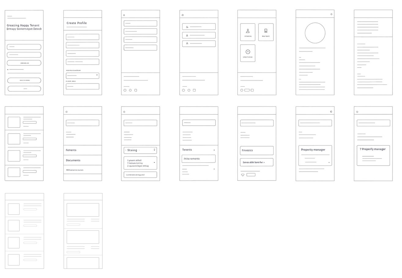
Low-fidelity wireframes were created to rapidly explore and validate layout logic, task flows, and content hierarchy. Key aspects validated during this phase included:
- Responsive Breakpoints: Optimized layouts for mobile (320px & 375px) and desktop (1024px+), including vertical stacking below 768px.
- Platform-Specific Designs: Prioritized clarity and essential navigation for mobile, while introducing expanded information architecture and persistent navigation for desktop users.
- 1024px+ (Desktop) Multi-column layout, persistent navigation, and enhanced visual hierarchy
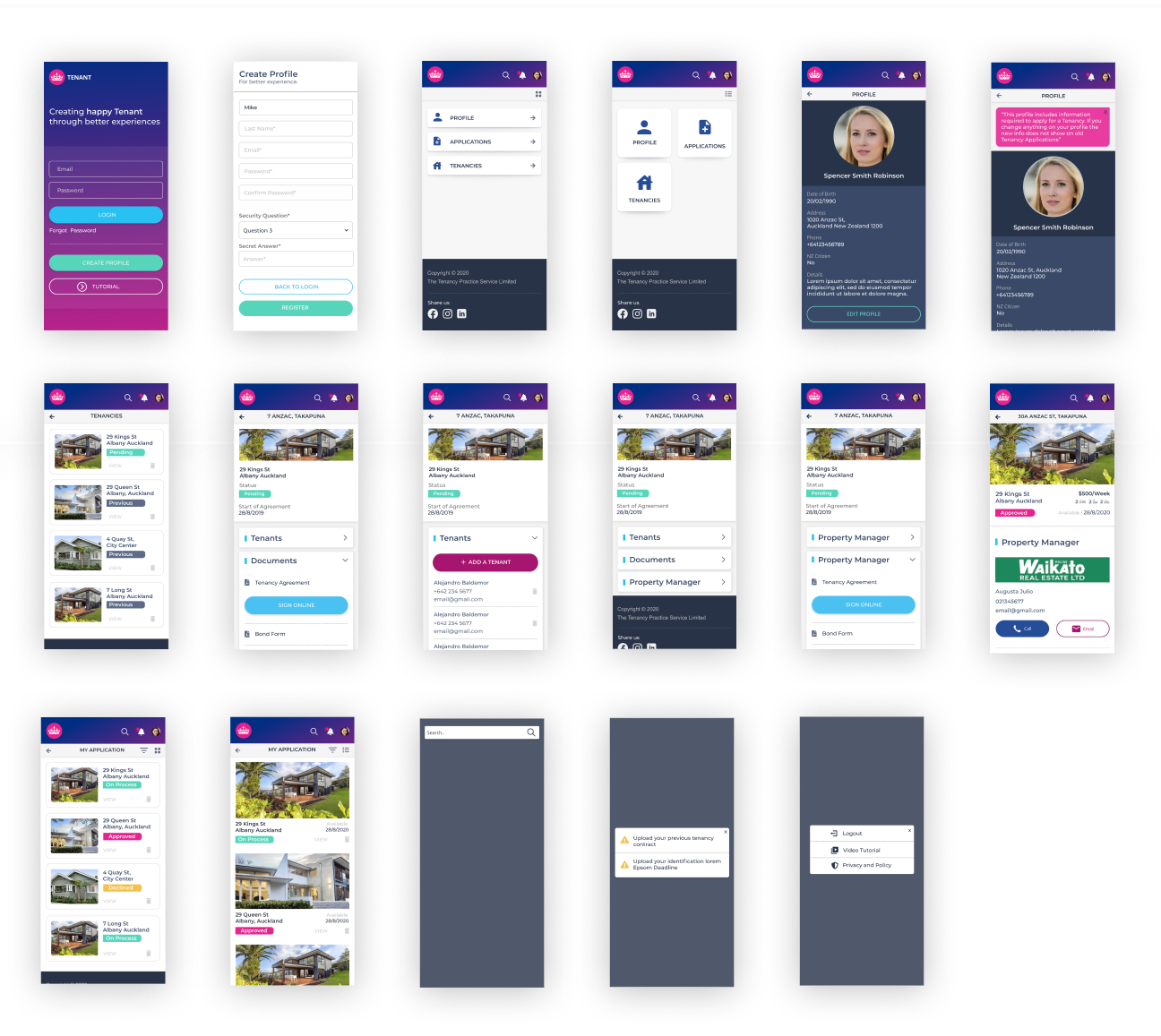
2. High-Fi Wireframes
After validating the foundational structure, I developed high-fidelity wireframes and interactive prototypes.
These included:
- Accessible Visuals:Scalable UI components, culturally neutral illustrations, and responsive layouts across devices
- Detailed Annotations:Annotated flows captured screen states, interaction logic, and accessibility decisions for developer handoff
- Validation:Prototypes were validated with real content, varied image ratios, and responsive resizing logic to anticipate friction points
Testing
User Testing & Insights
Usability testing was conducted with representative property manager and tenant users to gather qualitative insights. A/B testing was also implemented to gain quantitative data.
Key findings included:
- Improved Focus:The new visual hierarchy and reduced distractions improved user focus and efficiency
- Enhanced Comprehension:Illustrated guidance boosted comprehension and reduced task abandonment
- Faster Task Completion:Simplified navigation led to faster task completion and fewer errors
- Refinement Needed:Certain visual elements required further refinement based on user feedback to avoid confusion
Agile Collaboration & Delivery
The design process was tightly aligned with agile delivery rhythms, functioning as a sprint checkpoint to validate feasibility, prioritize backlog items, and de-risk implementation. Annotated prototypes supported developer handoff, while feedback loops with stakeholders ensured the solution was technically sound, emotionally clear, and accessible across devices. Breakpoint validation and accessibility audits were revisited throughout to ensure inclusive design outcomes.
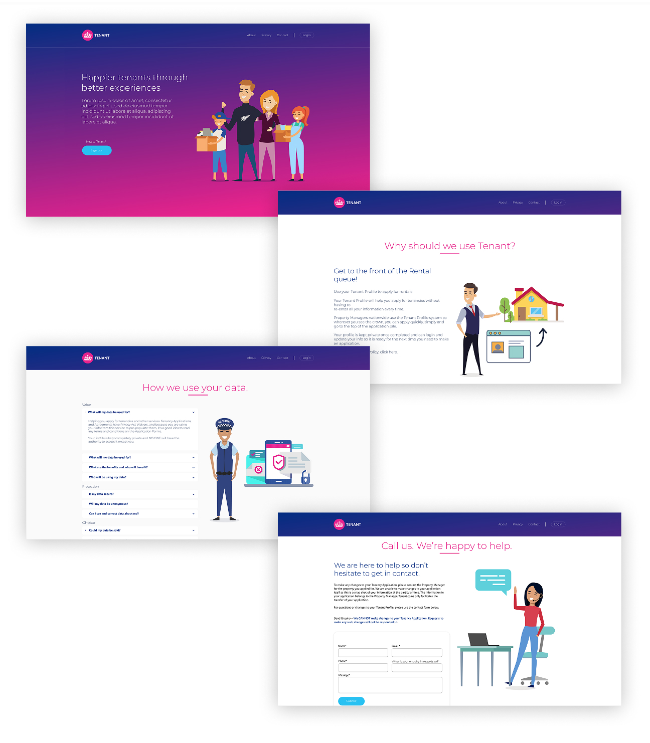
Final Design
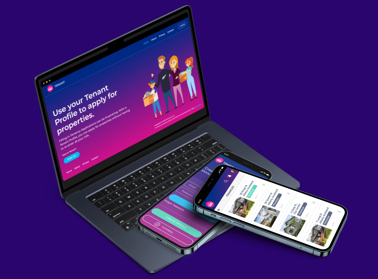
The final design combined accessible UI components, culturally neutral illustrations, and simplified navigation flows across both the marketing website platform and web portal. It introduced a more cohesive visual hierarchy, responsive layouts, and consistent interaction patterns aligned with modern usability standards.
Reflection & Impact
The redesign significantly improved clarity and reduced friction for users completing key tasks. The modernized enhancements on both the marketing website platform and the web portal resulted in a more seamless and positive experience for clients, leading to increased user satisfaction.