Individual Employment Plan


Project information
- Category: Government Web application / Self-service Digital Platform
- Client: Ministry of Social Development
- Project date: November 2023 - May 2024
- Project URL: my.msd.govt.nz
- Mobile Relevance & Platform Strategy
Note: The actual feature is not publicly accessible, as it is part of a client-based experience. Please refer to the wireframes and final design shown.
Although delivered within a responsive web platform, all design decisions prioritized mobile-first usability, accessibility, and delivery feasibility across breakpoints. Layouts were validated to ensure clarity, touch-friendly interaction, and WCAG compliance on smartphones and tablets. UI components were designed to scale fluidly across devices, with simplified navigation and reduced cognitive load tailored for mobile users.
Role & Responsibilities
- Role: Senior UX/UI Designer
- Key contribution: UX/UI Design, Stakeholder Collaboration, Ideation & Concept Development, Prototyping, Accessibility & Content Strategy
Overview
I led the UX/UI design for the "Individual Employment Plan" feature within MyMSD, a digital platform that supports beneficiaries across New Zealand. This initiative was part of a budget-sensitive Ministerial request aimed at reducing benefit dependency and supporting young people into employment.
The feature targets clients under 25 who have been receiving Jobseeker Support for more than three months and have work obligations. Employment plans for these clients are stored in CMS, which applies rules and assessments to recommend suitable programs tailored to their individual needs and barriers.
Objective
The goal was to enable MSD to create and manage personalized employment plans directly and display key information to clients within MyMSD. This would help young jobseekers stay informed and engaged in meeting their obligations, such as applying for jobs and attending interviews.
Emphathise
Research & Discovery
Due to the sensitive nature of the Ministerial request and tight timeline, initial research focused on understanding system dependencies and user eligibility criteria. I collaborated closely with the Portfolio Team to define the scope, constraints, and delivery expectations of the feature.
Key User Insights:
- Young jobseekers often feel overwhelmed by complex information related to their employment plans
- There is a risk of disengagement if the digital interface does not clearly communicate plan status and next steps
- The content presented in MyMSD must be minimal and tightly controlled by CMS rules to protect privacy and reduce complexity.
Define
Problem Definition
Young Jobseeker clients under 25 often struggle to understand and act on their employment plans because the information presented in MyMSD is minimal, conditional, and tightly controlled by CMS rules. The feature can only display when an active plan exists, and the content must remain limited to critical indicators to protect privacy and reduce complexity. These constraints risk leaving clients disengaged or confused if the interface does not clearly communicate plan status and next steps
Point of View (POV) Statement
Young jobseekers under 25 need a clear, intuitive way to understand their employment plan and next steps because minimal and conditional information from CMS makes it difficult for them to stay engaged and informed.
Key Design Challenges
Two primary challenges shaped the design direction:
- Conditional Visibility: The feature must only appear when a valid, active plan exists. This required precise logic and seamless integration between CMS and MyMSD.
- Minimalist Display: MyMSD should not show the full plan—only essential information to inform the client without overwhelming them.
These constraints demanded a clean, intuitive interface that could communicate status and next steps clearly, without exposing sensitive or unnecessary data.
Ideate
Reframing the Problem (How Might We Questions)
After synthesizing research and empathy findings, we reframed the problem into an actionable design challenge. we used the following "How Might We" (HMW) questions to guide our brainstorming:
How might we design a digital employment plan experience that keeps young jobseekers engaged and informed — while ensuring data integrity, minimal content complexity, and seamless integration with CMS rules and assessments?
How might we clearly communicate plan status and next steps, even with minimal content?
How might we balance clarity and engagement with strict data integrity and system dependencies?
Concept Exploration
To improve how clients understood and interacted with their Individual Employment Plan (IEP), I facilitated a structured ideation process grounded in clarity, simplicity, and consistency. The goal was to generate and prioritize design directions before committing to wireframes.
Through rapid exploration in Figma and collaborative prioritization — including sketching and dot‑based voting — stakeholders aligned on concepts that supported plan visibility, reduced cognitive load, and remained consistent with MyMSD’s design system. This ensured the direction was both user‑centered and technically feasible.
Generate and prioritize design directions before committing to wireframes
Dot voting helped stakeholders prioritize concepts that best supported plan visibility, reduced cognitive load, and aligned with MyMSD’s design system. This process ensured that the final direction was both user-centered and technically feasible.
Key themes that emerged:
By the end of ideation, we had aligned on a set of stakeholder‑backed concepts, giving us confidence in the direction to prototype next.
Prototype
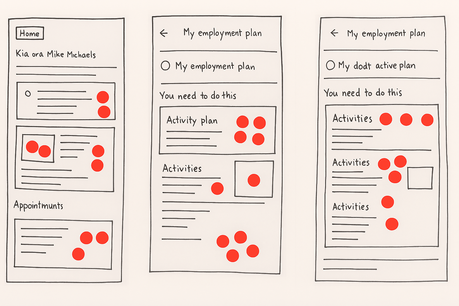
Low-Fidelity
The ideation and dot voting process directly informed which design concepts were prioritized. These insights became the foundation for developing and finalizing the preferred low-fidelity wireframes — covering the full user interface flow of the Individual Employment Plan feature.
Iterative mapping shaped the entire design process, guiding decisions from initial flow logic to final interface refinement. Each screen, from dashboard visibility to structured form entry, was aligned with CMS rules, accessibility standards, and stakeholder expectations through continuous mapping and validation.
While the wireframes shown here do not yet represent the full UI flow, they were developed to validate layout logic, interaction patterns, and stakeholder-backed design direction. These early sketches reflect key decisions from the ideation phase — including dashboard visibility logic, minimalist content hierarchy, and accessibility considerations.
Their purpose was to demonstrate alignment with CMS data rules and conditional visibility logic, and to prepare for stakeholder walkthroughs. Crucially, they also served to validate business expectations and delivery feasibility before translating concepts into high-fidelity design. While initial validation began with low-fidelity concepts, the Design Lab session itself was conducted using high-fidelity wireframes — ensuring clarity in tone, hierarchy, and interaction behavior across all components.
By translating stakeholder-backed concepts into structured wireframes, I was able to::
- Validate layout logic and interaction flow across dashboard, activity list, and form screens
- Ensure alignment with CMS data rules and conditional visibility logic
- Confirm accessibility and content clarity before moving into high-fidelity design
This step was critical in bridging ideation with delivery — ensuring that every screen was grounded in user needs, technical feasibility, and stakeholder consensus.
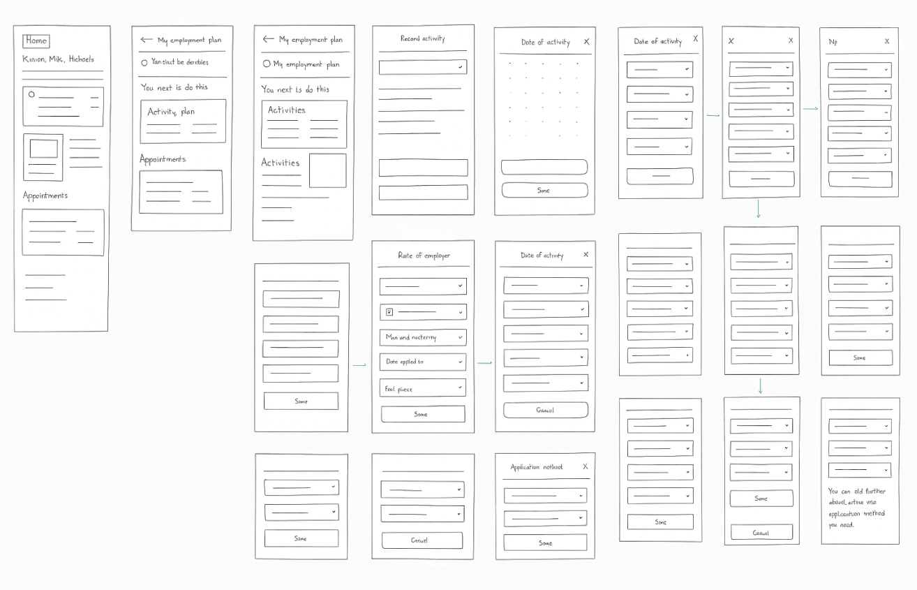
After ideation and dot voting clarified the preferred design direction, I created low-fidelity wireframes to visualize the full user interface flow of the Individual Employment Plan feature — including dashboard visibility, activity tracking, and structured form entry.
These wireframes focused on:
- Dashboard tile logic: Show plan status only when CMS confirms an active plan
- Activity list layout: Guide clients through required actions
- Add Job Search Activity form: Capture structured input with clear labels and validation
- Edit flow: Allow updates to previously submitted entries
- Error handling and accessibility: Ensure clarity for low-literacy users and screen reader compatibility
These wireframes were used to:
- Validate layout and logic: With developers, content, and accessibility teams
- Align with CMS data structure: And conditional visibility rules
- Refine hierarchy and messaging: Before visual styling
- Prepare for walkthroughs: With stakeholders and Design Lab validation
Design System & Breakpoint Validation
All wireframes were structured using MyMSD’s design system components to ensure consistency, scalability, and efficient handoff. Layouts were tested at key breakpoints to validate hierarchy, tap target spacing, and content clarity on mobile devices. These decisions supported delivery feasibility across CMS and responsive views, aligning with front-end implementation constraints.
High-Fidelity Wireframes
Building on the validated low-fidelity structure, I developed high-fidelity wireframes that applied MyMSD’s design system, accessibility standards, and directional flow. These visuals clarified hierarchy, tone, and interaction patterns — ready for stakeholder review and development handoff.
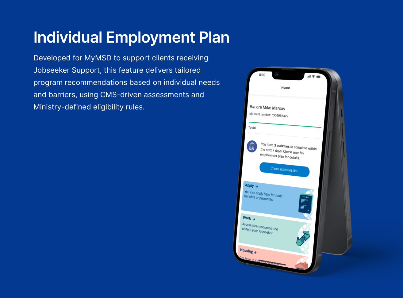
1. Main Dashboard View
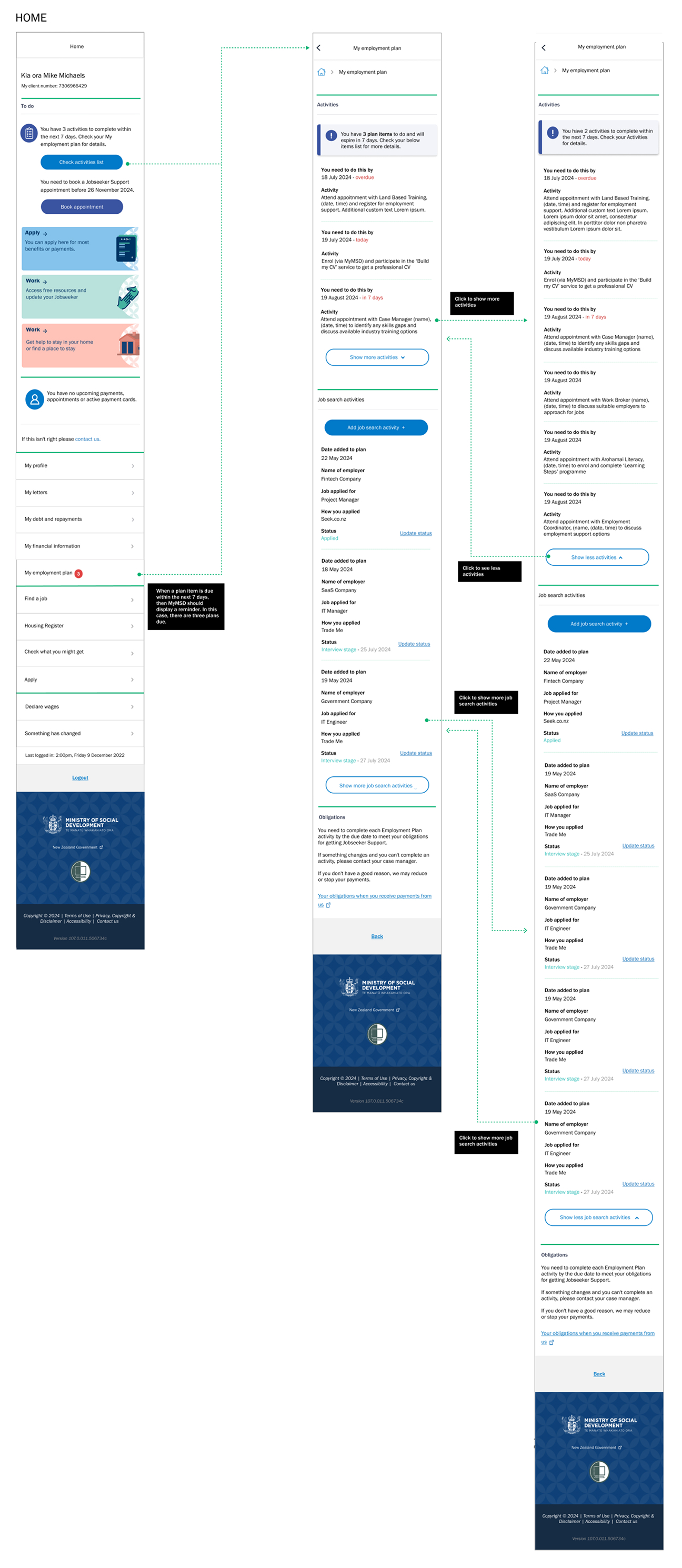
- A dedicated to do labeled section “You have activities to complete” appears on the MyMSD dashboard when CMS confirms an active plan.
- In the main page, they can see their activity list to for them to complete
- A prominent “Add Job Search Activity” button allows clients to log their efforts directly, supporting compliance and engagement.
2. Add Job Search Activity Form

- Upon clicking the button, users are presented with a structured form to input job search details.
- Fields include employer name, role applied for, application date, and outcome (e.g., applied, interview stage).
- The form design emphasizes clarity and accessibility, with labels, hints, and keyboard-friendly navigation.
3. Update Existing Application

- Users can view previously submitted job search entries and update them via an “Edit” option.
- The update form mirrors the original input structure form the CMS platform but includes pre-filled data for easy modification.
- The form design emphasizes clarity and accessibility, with labels, hints, and keyboard-friendly navigation.
4. Validation & Error Handling

- All forms include real-time validation to prevent incomplete or incorrect submissions.
- The update form mirrors the original input structure form the CMS platform but includes pre-filled data for easy modification.
- The form design emphasizes clarity and accessibility, with labels, hints, and keyboard-friendly navigation.
These prototypes were used for internal reviews and stakeholder walkthroughs to validate logic, usability, and design clarity. Feedback informed refinements to layout, messaging, and interaction patterns, ensuring the final solution met both technical constraints and user needs.
Testing
Validate
To ensure the proposed solution met both user needs and technical constraints, I facilitated a focused Design Lab session with cross-functional stakeholders. This included representatives from:
- Digital Product Owner and Product Manager — to validate scope, prioritization logic, and release feasibility
- Front-End Developer — to confirm technical handoffs, CMS integration, and dynamic UI behavior
- Accessibility Team — to ensure WCAG compliance, screen reader compatibility, and inclusive interaction patterns
- Comms and Content Team — to refine messaging, tone, and accessibility language
- Portfolio Team and Service Advisors — to align with operational realities and frontline experience
Session goals:
- Validate logic and visibility rules: Ensure dashboard and form flows match CMS conditions
- Test clarity: Of UI components and messaging
- Identify risks: In data handoffs and form interactions
- Ensure accessibility compliance: Across devices and user contexts
- Align tone: With MSD’s communication standards
These sessions also served as iterative checkpoints, where updated wireframes and flow maps were reviewed collaboratively to validate logic, surface risks, and evolve the design based on real-time feedback.
Session outcomes:
- Confirmed dashboard and form flows: Aligned with client expectations
- Refined error messaging: And input field labels based on Comms and service advisor feedback
- Ensured developer alignment: On CMS data structure and UI responsiveness
This session was instrumental in aligning design intent with delivery constraints, content strategy, and inclusive experience goals — reinforcing the importance of minimalist, directive interfaces in high-stakes government platforms.
Agile Collaboration
The Design Lab session mirrored agile ceremonies, functioning as a sprint checkpoint to align backlog priorities, validate feasibility, and de-risk delivery. Annotated wireframes and structured specs supported seamless handoff to developers, while feedback loops with content, accessibility, and service advisors ensured the solution was both technically sound and user-centered.
Final Design
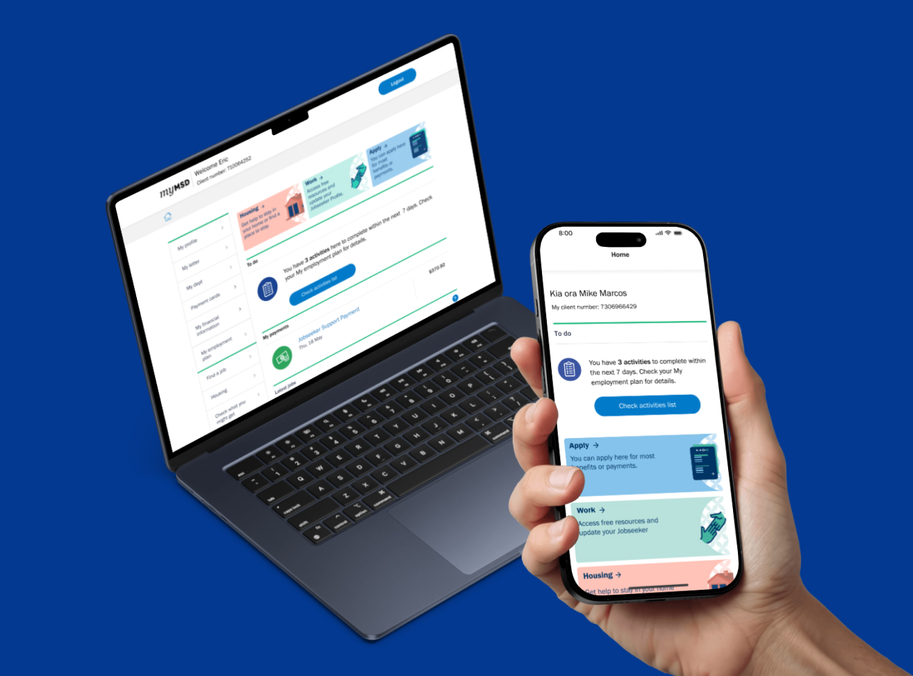
The final design integrates seamlessly with MyMSD’s existing UI, displaying employment plan status only when relevant. Post-validation feedback confirmed improved clarity, reduced support queries, and strong alignment with accessibility standards across devices—including mobile breakpoints. The solution was delivered on time, within scope, and with stakeholder consensus—reinforcing the value of minimalist, directive interfaces in high-stakes government platforms.
Key interface elements:
- A clean, accessible tile on the dashboard
- Minimalist content showing plan activation and next steps
- System logic that ensures visibility only when CMS confirms an active plan
This feature supports MSD’s broader goal of reducing benefit dependency and empowering young people to engage with employment services. It also lays the groundwork for future enhancements, such as program tracking and appointment reminders.
Impact
- Post‑validation feedback confirmed improved clarity for jobseekers
- Reduced support queries
- Strong alignment with accessibility standards across devices, including mobile breakpoints
Reflect
Learnings
This project reinforced that clarity, accessibility, and early stakeholder alignment are the foundations of scalable design. I learned that minimalist, directive interfaces outperform complexity in high‑stakes contexts, and that embedding accessibility from the start shapes both content and interaction. Most importantly, I realized my role extends beyond creating screens — to facilitating collaboration, aligning diverse perspectives, and ensuring inclusive outcomes.